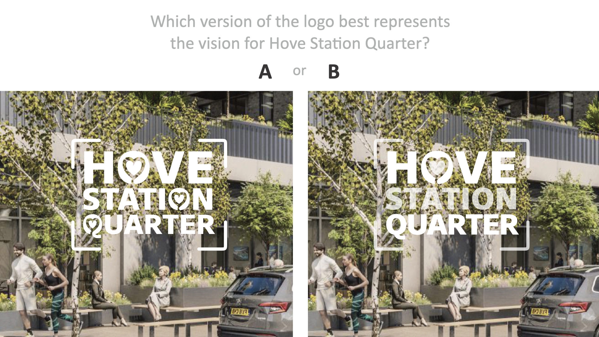
The area around Hove Station is fundamentally changing, in terms of inhabitants, skyline, streetscape, housing, commerce and transport. We’ve created a logo to help ensure the regeneration stays true to the vision. The logo will be used on maps, brochures, newsletters, and official documents. Here are the final two options. Tell us what you think in the comments below..

Have Your Say on the final design
Since 2013, HSNF members have been working with the planners, architects and developers to create a sense of community, a sense of place, a cohesive and inclusive identity for the area… a new Hove Station Quarter.
Part of this process is creating a logo for the area. Here are the final two options, and we’d really appreciate your thoughts. Do you prefer ‘A’ or ‘B’? Tell us in the comments section below.
The story behind the logo design
The area around the station has always felt different to the beachfront area below, and the park above. As the area grows and regenerates, it needs to feel more residential, more neighbourly, it needs to re-define and re-establish its own identity… and find its heart and soul.

The frame of the logo is optional and flexible, depending on what needs to be conveyed
Designer Mike Whelan has provided two logo options for members to decide, and an accompanying video and PDF document explaining the importance of place-making. The PDF also articulates the following:
- Background info,
- Vision & Concept,
- Mockups of the logo in different contexts,
- Comparison with other regeneration zones.
Watch our videos:
Place Making or Branding is similar to the creation of the Neighbourhood Plan, so several stages have already been explored, but it is often described as a thankless task.
We’d really appreciate some constructive feedback. Do you prefer ‘A’ or ‘B’? Tell us in the comments section below.
“the perception of places does often contain rather simple stereotypes. On the other hand, inhabitants are very diverse, making it nearly impossible to construct a simple homogeneous place identity.”
– Zenker, Peterson, 2010
The Full Vision for Hove Station Urban Quarter:
The vision is summarised as:
a vibrant and inclusive community…
a great place to live, work and relax.
In the Neighbourhood Plan and the council’s Supplementary Planning Document, it is fully expressed as:
- good connections with surrounding neighbourhoods and the wider city, with attractive pedestrian & cycle friendly routes accessible by all;
- a broad range of employment uses, including facilities to support start-up and creative industries;
- integration of new employment with a diverse range of other uses to create a lively, diverse urban quarter – these uses to include housing of different types and tenures, along with retail, leisure and community facilities to support day-to-day living;
- a coherent, legible and attractive network of streets and spaces that include ‘greening’, space for play and prioritise the movements of pedestrians and cyclists over cars;
- a built environment that meets a wide range of access needs, including those with visual impairments;
- well-designed buildings that physically define and overlook the streets and spaces; and
- a wide range of design features and facilities that make a major contribution towards the realisation of a carbon neutral and sustainable city.


